Color Psychology: How to Use Color to Enhance Clothing Wall Displays Appeal

In the apparel sales process, first impressions determine whether customers will stop and linger. Clothing Wall Displays leverages color psychology to enhance the perceived value of clothing and increase the likelihood of customer dwell time.
Clothing Wall Displays: Improving Business Performance
1. Color can enhance visual appeal and brand value
Color is a very attractive element in display racks and can present various effects:
High-impact visual effects: High-saturation (pure, vibrant) and high-brightness (bright) colors have excellent visual energy. Using these colors on key walls can ensure that merchandise instantly attracts customers' attention, guides them deeper into the store, and directs foot traffic to new products or promotional areas.
Creating visual hierarchy: The arrangement of colors, such as gradient arrangements (from light to dark) or complementary contrasts. Visual merchandising teams can create a carefully designed visual path.
Focus on key elements: Create a visual focal point to enhance product visibility and importance. Utilizing strong color contrasts between the displayed clothing and the wall background (e.g., placing brightly colored merchandise against a soft gray wall) can create a visual "focal point."
2. Psychological Impact and Purchase Intention (Emotional and Psychological Influence)
Color psychology is leveraged to segment consumers, reinforce product categories, and stimulate specific purchasing behaviors.
|
Color Strategy |
Psychological Effect |
B2B Application / Merchandising Goal |
|
Warm Tones (Red, Orange, Yellow) |
Energy, Urgency, Excitement |
Stimulate impulse buying; Ideal for fast-fashion, high-turnover seasonal items, and sale messaging. |
|
Cool Tones (Blue, Green, Purple) |
Trust, Stability, Sophistication |
Build credibility; Essential for business wear, tailored clothing, or products emphasizing sustainability. |
|
Neutral Tones (Black, White, Gray, Beige) |
Luxury, Elegance, Minimalism |
Premiumization strategy; Use as a backdrop to allow product texture and silhouette to dominate. |
|
High Purity/Saturation |
Boldness, Youthful Energy |
Targeting younger demographics; Highlighting trend-driven collections and statement pieces. |
|
Low Purity/Muted |
Comfort, Classic, Tranquility |
Appeals to mature or high-income clientele; Enhancing display of premium knits and essential collections. |
The careful selection of the wall and display colors supports the emotional storytelling, effectively priming the customer's mood to align with the product's intended use or category.
3. Enhance Perceived Product Value
Color choice influences customers' perceived value of a product.
Soft tones typically evoke a sense of softness and comfort (ideally suited for cashmere, silk, or high-end knitwear), making customers feel they are getting more than their money's worth.
Seasonal Hints: Color combinations can instantly convey seasonal information. Bright, light colors (soft hues, white) herald the arrival of spring and summer, thus accelerating inventory turnover. Deep, saturated, and rich colors (burgundy, forest green, navy blue) foreshadow autumn and winter, satisfying customers' expectations for warmth and a sense of weight.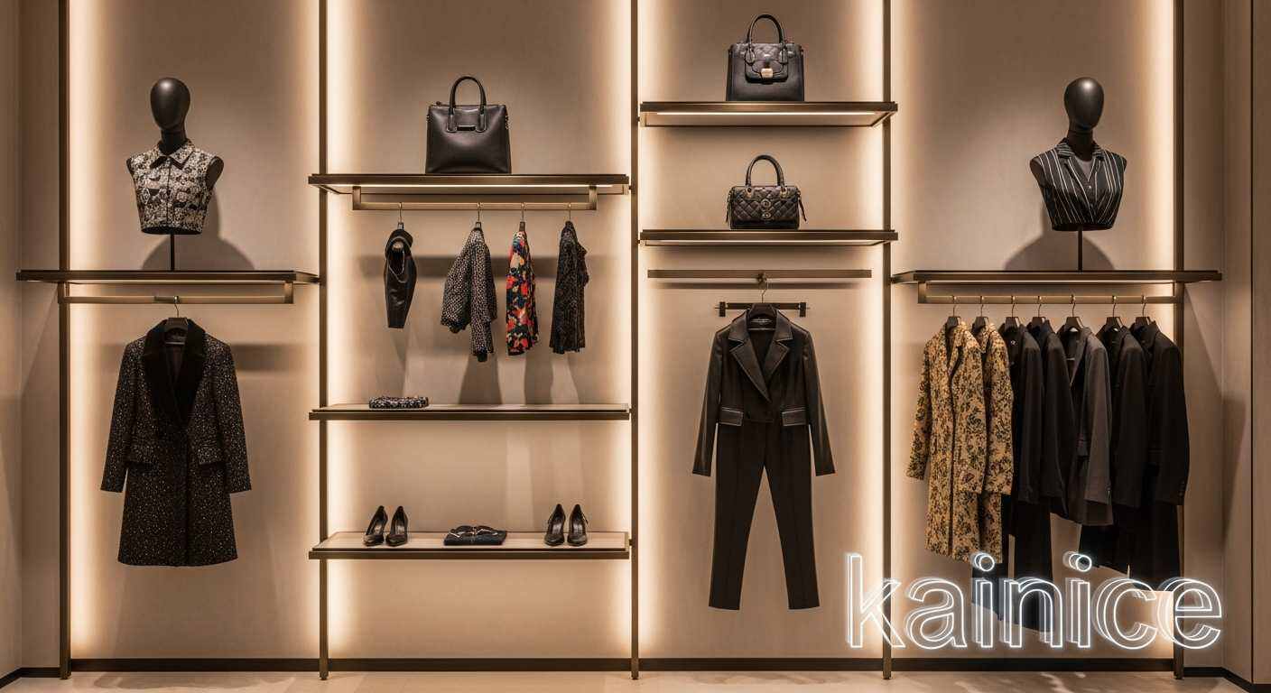
Clothing Wall Displays: Merchandise Display and Zoning
Category Zoning: Using different color strategies helps to divide merchandise areas, speeding up customer searches and improving shopping efficiency.
Visual Balance: Utilize color to create a weight-based zoning, placing heavier items at the bottom of the wall and lighter items at the top, creating a sense of visual balance.